
In this post, you’ll get access to five of the best and most helpful free tools that you can use during your crypto investing journey. These help gauge what particular phase of a market cycle we’re in and help mark excellent buying and selling areas.
1) The Fear and Greed Index: An Excellent Market Sentiment Gauge
One of the best free tools is the “Crypto Fear & Greed Index,” compiled by Alternative.me. This fear and greed meter uses six data sources to plot the emotional sentiment of the crypto market. It uses volatility, market momentum, social media, surveys, Bitcoin dominance, and trends to analyze the sentiment at any given time during a market cycle. Here’s what it shows on any given day.

This tool works very well with Warren Buffett’s quote, “Be fearful when others are greedy and greedy when others are fearful.” The goal, of course, is to buy during peak fear and take profits during high periods of greed or euphoria.
LookIntoBitcoin Charts
Our friends at LookIntoBitcoin have compiled an incredible website of free tools. There are five great long-term charts on lookintobitcoin.com to add to your tool bag that I’d like to highlight. If you want to learn more about these charts and their specific data and indicators, you can go to lookintobitcoin.com, click on “Bitcoin Charts,” and do some exploring. Now, let’s get to the five most helpful long-term charts:
2) The 2-Year MA Multiplier
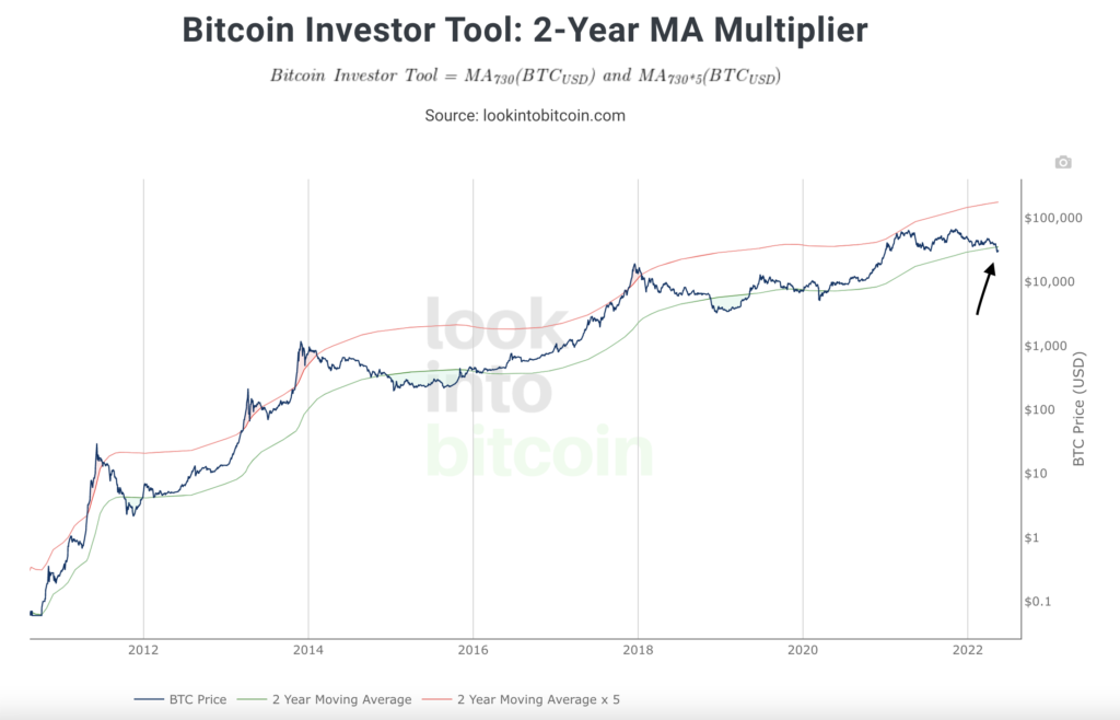
With this chart, any time Bitcoin’s price has popped above or touched the upper red line, it’s historically been a good time to take profits. Notice that in our most recent cycle, Bitcoin did not poke above this line. This is the perfect example of some models beginning to have slight variations in their accuracy as Bitcoin matures.
Any time the price has fallen below or touched the lower green line in the 2-Year MA chart, it’s historically been an excellent time to back up the truck and load up as much Bitcoin as possible. Notice where we are in our most recent market cycle. It appears to be the beginning of an excellent buying period.
3) The 200-Week Moving Average Heatmap
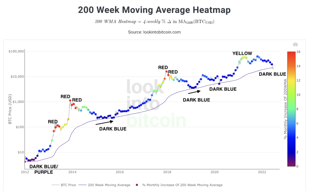
This tool helps us recognize times when Bitcoin’s price might be “overheated” as noted by the red dots or “overcooled” by the dark blue and purple dots. Once again, Bitcoin did not get to the red zone in our most recent cycle. Any time the price hovers in the dark blue range and is close to or below the 200-week moving average (thin lower line), it has historically been a good time to accumulate. Look at how many more blue data points we’ve had versus red and orange. This chart shows that, historically, it’s usually been a good time to be buying Bitcoin.
4) The Puell Multiple
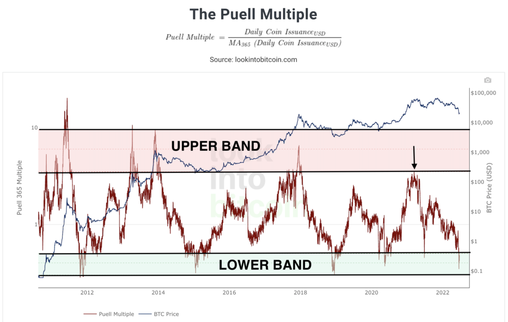
This chart that has been highly helpful in identifying Bitcoin tops and bottoms. Any time that the Puell Multiple has moved into the upper horizontal band, it’s been a good time to consider taking profits or at least pause the buying.
This is the third model in a row where the behavior has been slightly different for Bitcoin. Notice how the Puell Multiple only touched the upper band instead of entering it like in the three previous Bitcoin tops.
Conversely, any time the Puell Multiple has touched the lower horizontal band, it’s been a fantastic time to load up for the next bull market.
5) The MVRV Z-Score
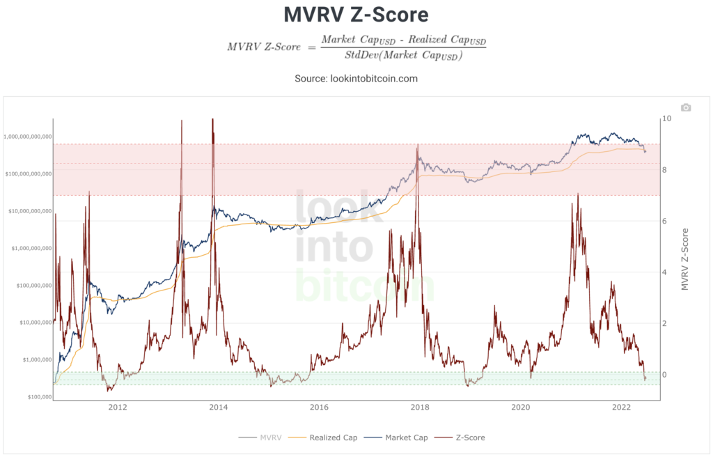
This historical chart has been perfect in marking Bitcoin tops and bottoms in the previous three market cycles. Similar to the Puell Multiple, any time the Z-Score has entered or touched the upper red band, it’s been an excellent time to take profits or pause buying for the cycle. Yet again, in this most recent cycle, the model did not enter the upper band like the previous tops, only brushing the zone instead.
Any time the ratio has entered or touched the bottom green band, wow, it’s been a good time to be a buyer of Bitcoin. We’re now in the bottom band, once again indicating an excellent time to start accumulating Bitcoin.
You can check back in with these tools whenever you want. They serve as excellent long-term guides for us as crypto investors. In the next post, we’ll take a look at the best Bitcoin historical charts that exist today.
Thanks for reading! If you enjoyed this, check out the other articles and don’t forget to follow me on Twitter @andrewdfarrar for up-to-date crypto content. If you haven’t already checked it out, my book, The Modern Investor, is up for sale on Amazon! It gives a much more complete and entertaining view into the digital asset market. In these crazy times, it’s never been a more important time to learn about this new asset class.