In this post, we’ll be learning about trading ranges, candles, wicks, support, and resistance, and other terminology that’s critically important for understanding charts and ultimately learning how to spot excellent times to buy and sell assets. As always, I’ll keep this as short and straight to the point as possible.
What is a Trading Range?
Let’s explore several important terms that will help us understand price behavior within an asset’s trading range. A trading range is simply a constrained area in which an asset trades. It has a defined upper range (resistance) and a defined lower range (support) and price fluctuates up and down within this range. The following image shows a typical horizontal trading range.
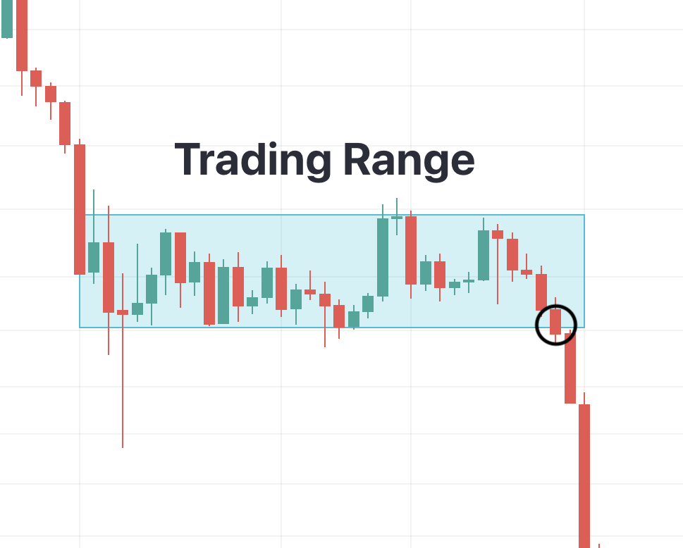
Source: BLX on TradingView; Daily Chart; May 8, 2022-June 9, 2022.
In this image, the asset’s price oscillated or chopped up and down in this range until finally breaking the lower support band. An asset either exits the upper band of a trading range and explodes to the upside or it exits the lower band of a range and craters to the downside. How do we know when it has “exited” the trading range?
Each bar you’re looking at in the figure above is called a “candle” and represents one day of price action. Some of these candles look like they have a wick on either the top or bottom of the body. A “wick” signifies the highest (if on top of the candle) and lowest (if on the bottom of candle) points at which an asset has traded within a specific time period. As you can see, some candles have long wicks and some have short wicks.
Like an early 2000’s Shakira music video, it’s all about the body. The “body” of a candle represents the opening and closing of the asset’s price in any particular time frame.

For determining the outcome of a trading range, we’re not concerned with the wicks. We only care about the bodies of the candles. We draw support and resistance based on the close of the bodies, not the wicks. The upper band of this trading range is resistance because it’s acting as a clear line in the sand where price gets rejected each and every time it hits this zone. The lower band of this image is called support because every time price touches this region, it buoys back up.
In our trading range image, the circled candle is the one that decided the outcome of the trading range. This is because the body of the candle closed below the bottom support band of the range. As you can see, the result was that the asset moved strongly to new lows in the following days once the trading range was broken.
There you have it. We learned about trading ranges, candles, wicks vs. bodies, support and resistance, and why the price of an asset moves strongly to the upside or downside following a trading range.
Thanks for reading! If you enjoyed this, check out the other articles and don’t forget to follow me on Twitter @andrewdfarrar for up-to-date crypto content. If you haven’t already checked it out, my book, The Modern Investor, is up for sale on Amazon! It gives a much more complete and entertaining view into the digital asset market. In these crazy times, it’s never been a more important time to learn about this new asset class.